Esterbrook LJ in Copper Marble

This is a somewhat unique fountain pen.  This was the first fountain pen that allowed you to easily change the nib.  It simply unscrews from the barrel, and a different nib could be used.  You could use a fine point nib for writing a letter, and then change to a broad or stub nib to address the envelope to add some flair to the writing.

These were not expensive pens, relatively speaking, and were made in large quantities.  The ink sac frequently needs to be replaced after many years of use (or lack of use), but that is a fairly easy thing to do.

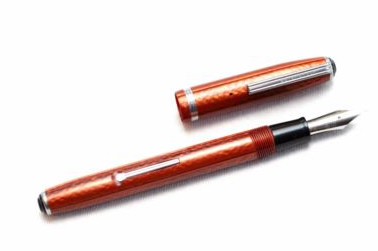
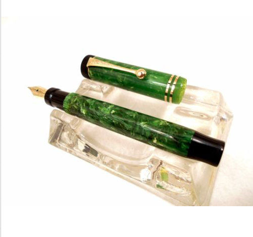
The colors are unique, and the hardware such as the lever, the clip, and the ring on the cap were made of stainless steel, so there is no plated finish to wear off, and the pen continues to look good even after extensive use.

Because these were made in large quantities, and are so easily repaired, they are popular today and don’t command large prices as many other pens from that era seem to do.  Average prices are in the $20 to $30 range, and the parts to replace the ink sac are a couple of dollars.  They are easy to find, and replacement nibs are easily found as well.

I liked the color of this particular pen, and I will be keeping an eye out for a broad or stub nib for it.

Esterbrook LJ

The latest (oldest) acquisition

Well, it’s my most recent pen purchase, but at the same time it’s the oldest one I have.  A Parker Streamline Duofold in jade green from 1928-1929.  Almost 100 years old and writes beautifully.  I’ve said it before but it bears repeating – craftmanship never fades.

Parker Duofold Jade Green

Ink

No, not a tattoo, but the ink for a fountain pen.  There are a multitude of colors, some with shimmering gold flakes and multiple colors combined into a single ink.

So far, I’ve purchased Diamine inks, in 3 different colors.  The first was ASA Blue, which is a fairly standard blue ink.  The next choice was Quartz Black.  It seems that naming ink colors is a lot like naming paint colors.  A lot of different ways to say the same thing.  Ah, marketing.

The third color I chose was Ancient Copper.  I chose it specifically for another fountain pen, a TWSBI Vac Mini with a 1.1mm stub nib.  This particular nib gives good variations in line width depending on whether the stroke is down (wide) or across (narrow).  It gives your handwriting a flair, and forces you to slow down a bit for the best appearance.  Since the nib is flat on the end, you have to be sure that you aren’t twisting the pen as you write or the stroke will dry out and you’ll just be scratching the paper.

TWSBI Vac Mini

I think I’m getting the hang of it now, but it does take some practice to write consistently with it.  I make a lot of notes while I’m working, so I am using that as a practice opportunity (since I’m the only one that reads my notes) and it doesn’t have to be perfectly readable.

There is one ink I would like to try, for fancy notes, cards, and invitations.  I don’t normally write cards or invitations, but this particular ink is fascinating.  It is Emerald of Chivor and I’ve “borrowed” this image from the Goulet Pens website so that you can see what I’m try to describe.  It’s pretty striking, isn’t it?