No, not a tattoo, but the ink for a fountain pen. There are a multitude of colors, some with shimmering gold flakes and multiple colors combined into a single ink.
So far, I’ve purchased Diamine inks, in 3 different colors. The first was ASA Blue, which is a fairly standard blue ink. The next choice was Quartz Black. It seems that naming ink colors is a lot like naming paint colors. A lot of different ways to say the same thing. Ah, marketing.
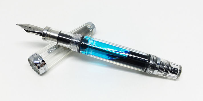
The third color I chose was Ancient Copper. I chose it specifically for another fountain pen, a TWSBI Vac Mini with a 1.1mm stub nib. This particular nib gives good variations in line width depending on whether the stroke is down (wide) or across (narrow). It gives your handwriting a flair, and forces you to slow down a bit for the best appearance. Since the nib is flat on the end, you have to be sure that you aren’t twisting the pen as you write or the stroke will dry out and you’ll just be scratching the paper.

I think I’m getting the hang of it now, but it does take some practice to write consistently with it. I make a lot of notes while I’m working, so I am using that as a practice opportunity (since I’m the only one that reads my notes) and it doesn’t have to be perfectly readable.
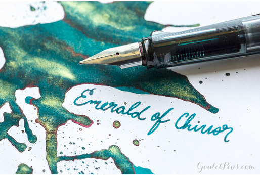
There is one ink I would like to try, for fancy notes, cards, and invitations. I don’t normally write cards or invitations, but this particular ink is fascinating. It is Emerald of Chivor and I’ve “borrowed” this image from the Goulet Pens website so that you can see what I’m try to describe. It’s pretty striking, isn’t it?

